top of page
Venmo limitations
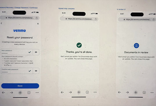
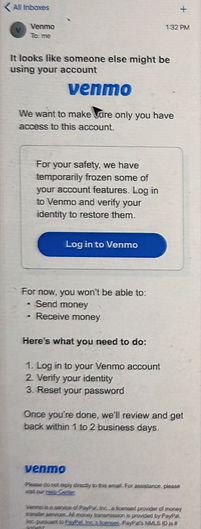
Context: A limitation is a block applied to user accounts when risks are flagged for suspicious activities and account changes. This model works as a security measure for accounts, where blocks are put to protect an account from fraud. When this is done, users won't be able to move their money or transact until they provide the necessary IDs or documents for verification. This ensures that the account is being used only by the rightful account owner and not by any fraudster. Once the user submits the needed documents, a quick review is done, and the blocks are lifted, giving them full access to their accounts.
Considering the criticality of such situations, it was important for us to design an experience that was simple, easy to use, and also helped the user to get back full use of their accounts quickly. We had to choose the right terminology, language, and tone to convey the negative news, help users complete the needed actions, and lift the blocks.
My guidance: I guided the content designers to figure out approaches, construct the content strategy goals, and pick the right tone and terminology. We had multiple brainstorming sessions to iterate, always working with a user-first approach. We worked with the design team to lay out the experience, iterate, and come up with a simple yet seamless experience.
Business objectives
-
Reduce fraud and help Venmo users keep their accounts secure.
-
Adapt and apply the limitations model to Venmo consumer accounts to keep their accounts secure.
Experience Goals:
Create an experience similar to the PayPal limitations journey, in the Venmo essence and context.
Imbibe the PayPal tone and voice without losing the Venmo brand identity.

The strategy
The strategy for this project was divided into three sections:
Voice and tone, Info Architecture, and Terminology.
To understand the Venmo brand better, my team did a lot of social listening, read community posts, etc. We handpicked terminology suitable for the project and worked on multiple iterations before settling on "frozen". The reason we chose this particular term was to use easy, everyday language that would appeal to the younger Venmo audience.

Info Architecture
We did multiple info architecture approaches, and created an approach that focused on giving users clear information on what was going on with their account and what they needed to do to fix the block placed.
The three sections of the dashboard were -
a) why we are placing the limitation or block,
b) what's the impact, and
c) how users should resolve it.

Creating a seamless experience
Though this was a negative experience, we aimed to create an experience that was seamless and easy for the user to quickly complete their tasks. We wanted to ensure users didn't feel overwhelmed with the number of tasks they had to do. My guidance to the team primarily was to make sure the experience was effortless, inclusive, and accessible to all types of users.

Effective guidance
It was essential to provide clear and effective guidance to users as they navigated a challenging situation. We had to ensure that users clearly understood what they had to do and what documents they had to submit to lift the block from their accounts.

Voice and Tone
Considering the younger audience we were catering to with Venmo, I guided the team to focus on selecting tones that were relevant to that audience’s mindset - energetic, positive, friendly, and conversational. We aimed to use everyday language that was simple, clear, and concise.
Terminology
We explored the usage of various terms like suspended, frozen, locked, and restricted. We wanted to keep terminology consistent across the experience and also resonate with the language used by the Venmo audience.
bottom of page